Neeyamo
Brand, Reimagined Through UX
When Neeyamo set out to modernise their brand for a new generation of users, we were brought in to reimagine the website experience. It began with an intensive week-long discovery workshop, the foundation for truly understanding the business and the people it serves.

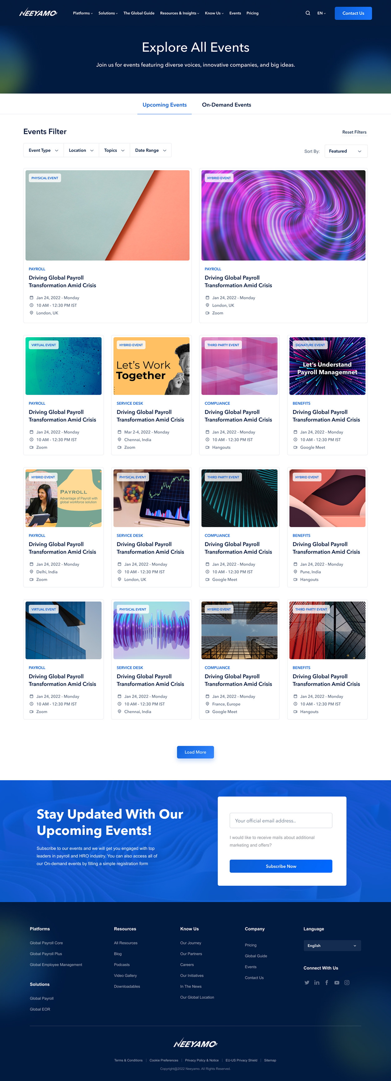
Trending Events
Let's Explore The Best Global Payroll & HRO Events Around The Globe
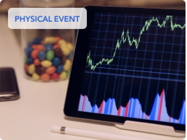
February 5-8, 2022 Chennai, India
Let's Work Together - A New Remote World


Workflows
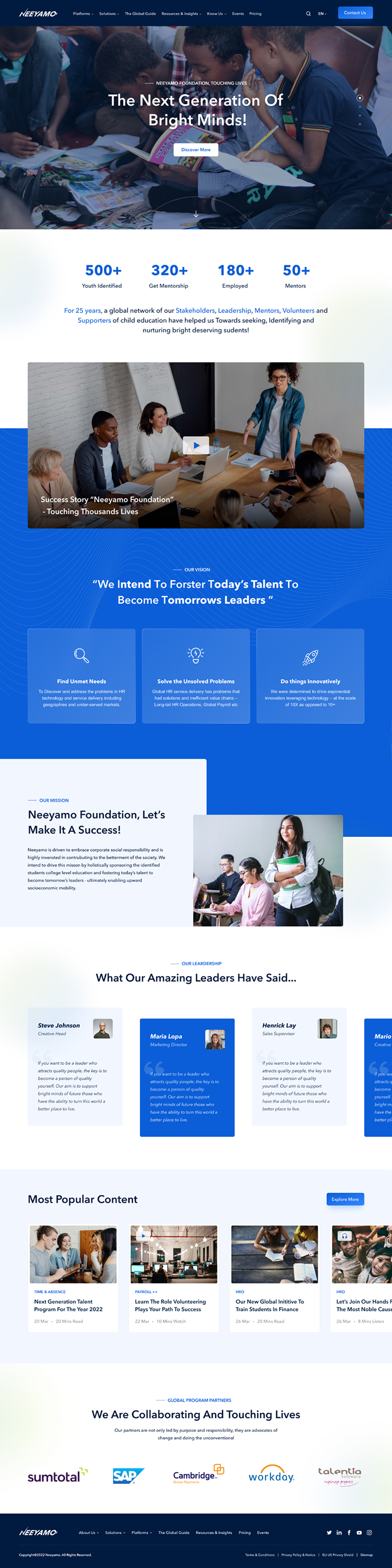
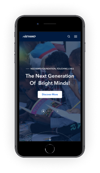
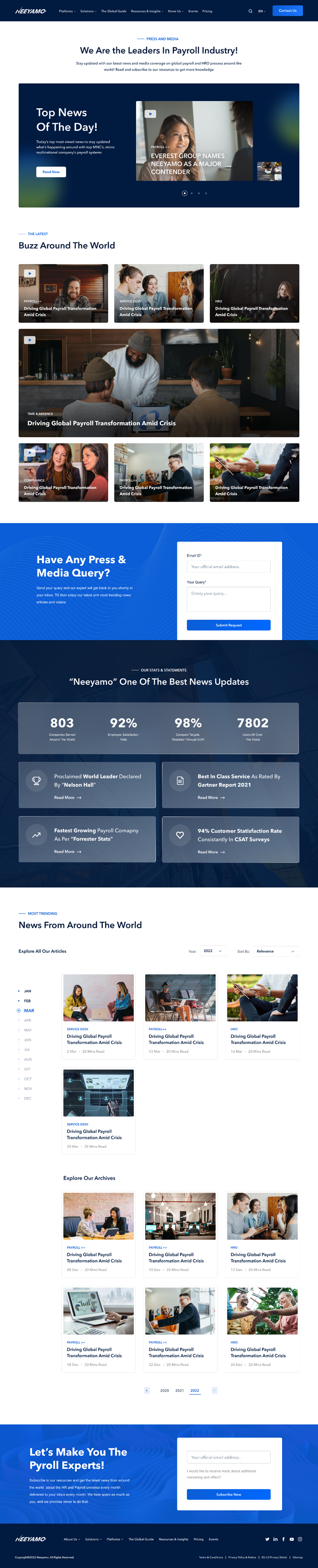
Final Designs
Scroll inside to view the complete UI



Style Guide
During the revamp of the website we have curated few new colours, gradients and button styles referring to existing brand guidelines of the site. Whitespace was used generously to give prominence to the content and simple fonts like Avenir Next and Arial were used. To bring in the real life connection human imageries were added.
Font Family Selection
abcdefghijklmnopqrstuvwxyz
1234567890
~!@#$%^&*()_+-={}[]?:;"',./\<>
abcdefghijklmnopqrstuvwxyz
1234567890
~!@#$%^&*()_+-={}[]?:;"',./\<>
Font Pairing Breakdown
Heading Font - Avenir Next
Body - Arial
Links/Buttons - Avenir Next
Type Scale
The type scale will be based on an 8pt scale, using 16px as the base font-size
Display
Used for desktop
Display - 58px
Demi Bold
Heading Bold
Heading 1 - 48px Bold
Heading 2 - 40px Bold
Heading 3 - 32px Bold
Heading 4 - 24px Bold Heading 5 - 20px Bold
Heading Demi Bold
Heading 1 - 48px Demi Bold
Heading 3 - 32px Demi Bold Heading 5 - 20px Demi Bold
Paragraph Medium
Body 1 - 24px MediumBody 2 - 20px MediumBody 3 - 16px Medium
Body Italic
Body 1 - 24px ItalicBody 2 - 20px ItalicBody 3 - 16px Italic
Body Copy
These fonts can be used both for mobile and desktop
Body Heading Large - 16px BoldBody Heading Small - 16px BoldLABEL - 14PX SEMIBOLD CAPFooter - 12px Regular
Button Styles
Main interactive call to action on the page
Primary Buttons
Secondary Buttons
Dark Buttons
Live site
https://www.neeyamo.com/