A Design System for Developers and Agents
How I rebuilt Qapita's design system so designers could prototype faster with AI using the real components, and engineers, and AI agents writing code, could ship consistent UI without a review on every screen.
A single component to compose your own screens. Available in different styles, states and backgrounds — every value bound to a token.
Context
Qapita is an equity-management platform, cap tables, ESOP administration, and digital share issuance, used by founders, finance teams, and employees across India and Southeast Asia.
The product's entire promise is a single, trustworthy source of truth for who owns what. That raises the stakes on interface consistency: when someone is approving an option exercise or reading their equity payslip, a screen that looks improvised reads as "can I trust this number?" Visual inconsistency isn't cosmetic here, it undercuts the core value proposition.
By the time I took this on, the platform served 2,500+ companies and 350,000+ stakeholders holding over USD 60 billion in equity across India and Southeast Asia. It had grown fast, and its interface had grown with it, in every direction at once.
Timeline
Audit
The existing system was React components layered on top of a mix of custom and open-source icon and UI libraries - built up over time, with no governing layer above it. Nobody owned consistency, so nothing stayed consistent. The audit put a number on the gap.
From a foundation nobody owned to a governed system: from “however it was built that day” to one documented answer.
Token Architecture
Assets

To identify gaps the existing icons assets were audited to identify specific icons in both, solid and outline variations, and a new and refreshed icon library was designed using Illustrator and Figma.
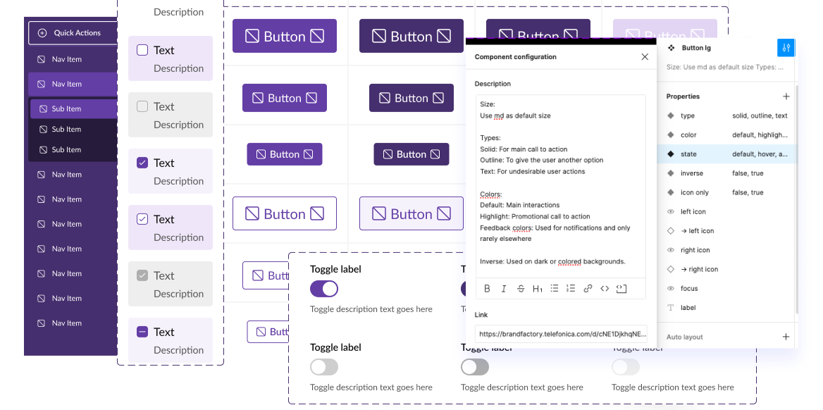
Components were built as reusable blocks of our design system. Each component meets a specific interaction need, and has been specifically created to work together to create patterns.
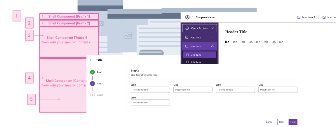
Patterns were designed in a way that they can be reused in different parts of the design journey. Based on the design requirements and refinements of a flow, compositions were created with the involvement of the designers and engineers along with product and brand teams.
One system, many brands
The three-layer model isn't drift-proofing for its own sake, it's what lets one system carry many brands.
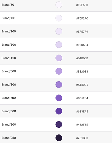
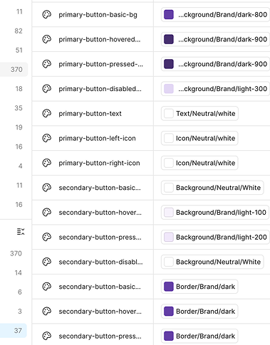
Color is organised into a small set of roles: a primary for identity and key actions, a secondary for accent and emphasis, and a neutral range for surfaces and text. Components reference only these roles, never raw values, so re-skinning for a different client is a base-palette swap, not a rebuild. Change the values behind the roles and every component re-skins at once. That's what lets the system scale from an in-house tool into a white-label foundation, shaped to each client we work with.
Metrics
The rollout is ongoing, so I'm treating early movement as signal, not proof. What I'm most deliberate about is how success gets measured, each metric ties back to a goal I set at the start.
| What I'm measuring | Why it matters | How it's captured |
|---|---|---|
| Component adoption | % of new screens built from system components vs. one-offs | Component-usage lint / codebase scan per release |
| Token coverage | % of styling from tokens vs. hardcoded hex | Static scan for raw hex/px in the codebase |
| Drift | Net-new one-off components created per sprint (trending to zero) | Tracked against the component request flow |
| Design-review load | Review rounds per UI feature | PR review data / design QA tickets |
| Agent spec-pass rate | % of agent-generated components passing spec-lint first try | Spec-lint on AI-generated PRs |
Early, directional signals so far: component reuse is up, drift has slowed, and the team reports UI features coming together faster with the system in place. I'm holding these loosely until the numbers above are instrumented.
Challenges and Learnings
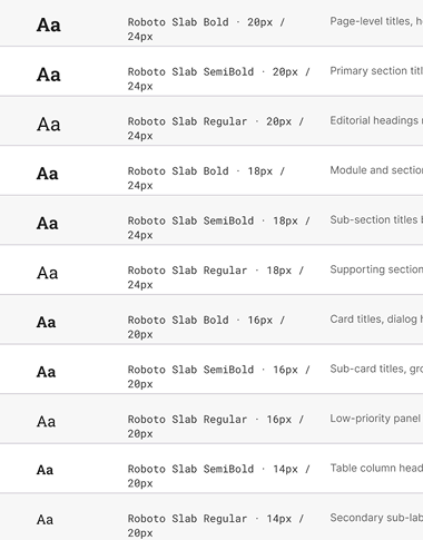
Getting consistency across product lines meant rules couldn't live in tribal knowledge or Figma comments, they had to be explicit enough for a designer, a developer, and an AI agent to read the same intent without translation. Forums and pattern libraries worked as the human-facing layer, but the real forcing function was writing naming and token rules precise enough that a non-human collaborator could parse them too.
Speed wasn't the goal until the system was mature enough to expose it as a gap: teams were rebuilding primitives instead of composing them. Once the library was structured and swappable, prototyping time collapsed, and that same structure is what let an agent assemble a feature from components without needing a human to hand-hold the logic.
Gaps kept surfacing at the handoff from brainstorm to production, components that looked reusable in Figma diverged the moment engineering touched them. The fix was continuous embedding, not a one-time sync: keeping designers, developers, and any AI-driven step aligned to the same source components throughout, so nothing needed re-interpretation downstream.